When it comes to designing a logo, the successful elements all come from the details of the design. This is especially the case when it comes to font and typography of the words on a design where every specific aspect of the wording will create a particular impression and will send a certain message. In this article, we present to you Your Complete Guide to Advanced Logo Typography & Letter Spacing
One of the particular elements that you’ll need to think about when it comes to the typography of your text is the letter spacing, otherwise known as ‘tracking.’ This refers to the spacing between each letter which may not seem like much, but it’s vital.
Today, we’re going to explore how letter spacing can be used in your logo design processes to create a certain impression and how you can use this information to your advantage. Let’s get right into it!
Table of Contents
Defining Letter Spacing (Tracking)
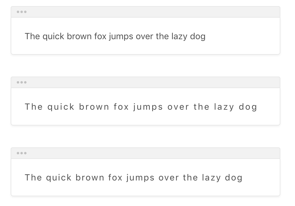
Firstly, so we’re all on the same page, let’s just clarify what exactly letter spacing is. Look at the letters on this post. The spacing in-between the letters is consistent throughout which means its easy to read because this is a regular format. Check out this image of multiple letter spacing examples;

As you can see, the original image at the top has regularly spacing, but the letters become further apart the more substantial the spacing value. As you can imagine, applying this concept in different situations can create different effects. Let’s explore some of them now.
Reason for Tracking: Readability
The first reason that designers will play with the tracking of wording within a logo format is that it adjusts the readability of the content. In a logo, you’ll tend to have 1-3 words maximum, but spacing these letters out is a great way to draw the reader’s attention to the words and make it easier to read, and therefore makes more of an impact when read.
“Of course, this can dramatically depend on the nature of the content and the words itself as to what will work better. Nevertheless, a lot of designers like to space out the letters to fill the visual part of the logo. This keeps everything balanced so it’s nice and neat while ensuring the design is compact and maintains its impact” shares Andrew, the Owner & Founder of The Logo Creative
Reason for Tracking: Visual Appearance
Of course, the second reason designers will play and experiment with the spacing of their letters is to enhance the visual appearance of the design. This could be to make the design more eye-catching or to create a certain impression or mentality.
For example, letters that are reasonably spaced out create quite a calm, collected and professional feeling when read. There’s no rush in understanding the content, and the reader can feel like they can take their time. This also creates quite a minimalistic feeling.
However, words with reduced spacing where the letters look fairly ‘smushed’ together can feel rushed and in your face. While readability can suffer, this kind of spacing creates a sense of urgency and impact that makes the reader quickly consume the content and creates a certain image along these lines.
What’s more, if you have a bit of content that’s supposed to fill a certain area, but it slightly overhangs, starts a new line, or doesn’t quite reach the edge of the designated area that makes everything lines up correctly, the line spacing can be adjusted to make this work, even if slightly which won’t tend to affect the visual appearance of the typography itself, but rather enhances the whole image.
Applying Letter Spacing to Your Logo Designs
“There’s no hard and fast rule as to what works and what doesn’t work when it comes to choosing which letter spacing to use in your logo designs. Of course, you can use the rules we’ve spoken about above, but your final choice will depend on the image and design you’re trying to create” shares David King, a health blogger for Origin Writings.
The best way to figure out what works is by playing around with the design and experimenting to see what works and what doesn’t. However, the most important thing to remember is to make sure you’re actually paying attention to the letter spacing you’re using and not ignoring it entirely and ultimately leaving your design uncompleted and not finished to its full potential.
Author Bio
Emily Marchant is a marketing manager at Phd Kingdom. She is responsible for renewing and retaining existing subscribers through campaigns that involve newsletters, sponsored content, partnerships, ads, and events.


